Benchmark GRN inference#
Library imports#
import pandas as pd

import matplotlib.pyplot as plt
import mplscience
import seaborn as sns

from rgv_tools import DATA_DIR, FIG_DIR
Constants#
DATASET = "mHSPC"
SAVE_DATA = True
if SAVE_DATA:
    (DATA_DIR / DATASET / "results").mkdir(parents=True, exist_ok=True)

SAVE_FIGURE = True
if SAVE_FIGURE:
    (FIG_DIR / DATASET).mkdir(parents=True, exist_ok=True)
Data loading#
tfv_score = pd.read_csv(DATA_DIR / DATASET / "results" / "GRN_benchmark_tfv.csv")
rgv_score = pd.read_csv(DATA_DIR / DATASET / "results" / "GRN_benchmark_rgv.csv")
grn_score = pd.read_csv(DATA_DIR / DATASET / "results" / "GRN_benchmark.csv")
df = pd.concat([tfv_score, rgv_score, grn_score], ignore_index=True)
Plot the benchmark#
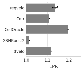
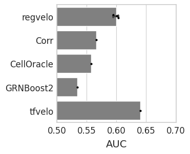
df
| Unnamed: 0 | EPR | AUC | Method | |
|---|---|---|---|---|
| 0 | 0 | 1.116878 | 0.639869 | tfvelo |
| 1 | 0 | 1.138696 | 0.603134 | regvelo |
| 2 | 1 | 1.145427 | 0.600968 | regvelo |
| 3 | 2 | 1.124305 | 0.594723 | regvelo |
| 4 | 0 | 1.108522 | 0.566040 | Corr |
| 5 | 1 | 1.014753 | 0.533928 | GRNBoost2 |
| 6 | 2 | 1.196337 | 0.557187 | CellOracle |
with mplscience.style_context():
    sns.set_style(style="whitegrid")
    fig, ax = plt.subplots(figsize=(3, 3), sharey=True)
    # Plot the second Seaborn plot on the first subplot
    sns.barplot(
        y="Method",
        x="AUC",
        data=df,
        capsize=0.1,
        color="grey",
        order=["regvelo", "Corr", "CellOracle", "GRNBoost2", "tfvelo"],
        ax=ax,
    )
    sns.stripplot(
        y="Method",
        x="AUC",
        data=df,
        order=["regvelo", "Corr", "CellOracle", "GRNBoost2", "tfvelo"],
        color="black",
        size=3,
        jitter=True,
        ax=ax,
    )
    ax.set_xlabel("AUC", fontsize=14)
    ax.set_ylabel("")
    plt.xlim(0.5, 0.7)
    plt.show()

    if SAVE_FIGURE:
        fig.savefig(FIG_DIR / DATASET / "AUC.svg", format="svg", transparent=True, bbox_inches="tight")
with mplscience.style_context():
    sns.set_style(style="whitegrid")
    fig, ax = plt.subplots(figsize=(3, 3), sharey=True)
    # Plot the second Seaborn plot on the first subplot
    sns.barplot(
        y="Method",
        x="EPR",
        data=df,
        capsize=0.1,
        color="grey",
        order=["regvelo", "Corr", "CellOracle", "GRNBoost2", "tfvelo"],
        ax=ax,
    )
    sns.stripplot(
        y="Method",
        x="EPR",
        data=df,
        order=["regvelo", "Corr", "CellOracle", "GRNBoost2", "tfvelo"],
        color="black",
        size=3,
        jitter=True,
        ax=ax,
    )
    ax.set_xlabel("EPR", fontsize=14)
    ax.set_ylabel("")
    plt.xlim(
        1.0,
    )
    plt.show()

    if SAVE_FIGURE:
        fig.savefig(FIG_DIR / DATASET / "EPR.svg", format="svg", transparent=True, bbox_inches="tight")